

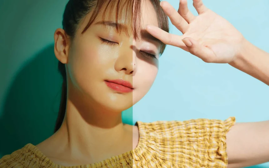
A photo can show the same person, place, or object while creating completely different feelings. Small changes in color, brightness, contrast, and saturation can make an image feel warm and welcoming, cool and distant, dramatic, nostalgic, or calm. That is why photographers and everyday creators often use a photo filter tool to adjust more than the appearance of a picture. A well-chosen filter helps communicate the emotion and atmosphere behind the image while keeping the original subject clear and believable.
What Is a Photo Filter?
A photo filter is an effect or collection of image adjustments that changes the visual qualities of a photograph. Digital filters can modify color temperature, saturation, brightness, shadows, highlights, contrast, tint, and other properties.
Some filters make major changes with one click. Others provide a starting point that users can fine-tune. The goal does not always have to be making a photograph prettier. Filters can help an image communicate a particular atmosphere or support the story the photographer wants to tell.
For example, imagine a photograph of an empty street after rain. Increasing blue and gray tones can make the scene feel quiet, cold, or reflective. Adding warmer tones to the same photograph can create the impression of evening light and make the scene feel more comfortable.
This difference is important because people do not respond only to what appears in an image. They also notice how the scene is presented.
Key takeaway: A photo filter changes visual properties such as color, contrast, and light. These adjustments can influence the atmosphere viewers associate with the photograph.
How Does Color Temperature Change the Feeling of a Photo?
Color temperature is one of the easiest ways to influence the mood of an image. In simple terms, it describes whether the colors in a photograph appear warmer or cooler.
Warm filters emphasize colors such as yellow, orange, and red. They can work well with sunsets, food, indoor scenes, portraits, travel photographs, and autumn landscapes. Depending on the subject and context, warmer processing can create a cozy, lively, or inviting appearance.
Cool filters move an image toward blue, cyan, or cooler neutral tones. These colors can support a clean, peaceful, wintry, distant, or subdued atmosphere.
Consider a portrait taken near a window. A slight increase in warmth can give skin and sunlight a softer appearance. Moving the same image toward blue may make the surrounding environment feel cooler and more restrained.
Context still matters. A warm filter does not automatically make every image cheerful, just as blue does not automatically make every photograph sad. The subject, lighting, composition, and viewer’s experience all contribute to the final impression.
Key takeaway: Warm and cool color adjustments can guide the atmosphere, but their emotional effect depends on the subject and the rest of the image.
Why Do Brightness and Exposure Affect Mood?
Brightness determines how light or dark an image appears, while exposure refers to the amount of light represented in the photograph. Adjusting either can quickly change how a scene feels.
Brighter images often reveal more detail and can create an open, light, or airy appearance. This approach is common in lifestyle, food, interior, and travel photography where clear details are important.
Darker processing can create a more intimate or dramatic result. Lowering exposure may draw attention to selected areas of light while allowing less important parts of the frame to move into shadow.
However, darkening a photograph too much can remove useful detail. Excessive brightness can also wash out highlights and weaken important textures.
A better approach is to ask what viewers should notice first. If a person’s face is the focal point, for example, keeping enough light on the face while slightly reducing the surrounding brightness can strengthen visual focus without making the entire picture unnecessarily dark.
Key takeaway: Brightness affects both visibility and atmosphere. Adjust exposure with the main subject in mind instead of simply making the entire image lighter or darker.
What Does Contrast Do to an Image?
Contrast is the visual difference between the light and dark areas of an image.
Higher contrast makes that difference stronger. Shadows become deeper, highlights appear brighter, and edges can look more defined. This can make certain photographs feel bold or dramatic.
Lower contrast reduces the separation between light and dark areas. The result can appear softer and more muted. This approach often suits misty landscapes, understated portraits, vintage-inspired photographs, and scenes where gentle transitions are part of the visual story.
Contrast should still preserve important details. If shadows become completely black or highlights lose all texture, viewers may miss information that contributes to the photograph.
Accessibility can matter too when photographs contain text. The W3C guidance on minimum contrast explains why sufficient contrast between text and its background improves readability.
Key takeaway: High contrast can strengthen visual intensity, while low contrast can create a softer appearance. Preserve enough detail for the subject and any text to remain clear.
How Can Saturation Change the Mood of a Photo?
Saturation controls the intensity of colors. Increasing it makes colors more vivid, while decreasing it makes them more muted.
Higher saturation can suit images where color itself is an important part of the scene. A photograph of a market, festival, garden, or colorful meal may benefit from a modest increase because it helps those colors stand out.
Lower saturation can shift attention away from color and toward shape, light, expression, and texture. Muted colors are often useful when a photographer wants a quieter or more restrained look.
At the far end of this process is black-and-white photography. Removing color completely changes how viewers process the scene because brightness, contrast, lines, textures, and composition become more prominent.
More saturation is not automatically better. Very strong saturation can make skin tones, skies, grass, and food appear unnatural. Small adjustments often produce a more convincing result.
Key takeaway: Saturation controls how strongly color competes for attention. Increase it when color supports the subject and reduce it when shape, texture, or light should play a larger role.
How Do Different Filter Styles Create Different Moods?
Filters usually change several properties at once. Understanding common styles makes it easier to choose one intentionally instead of selecting an effect simply because it looks fashionable.
Warm and Golden Filters
Warm filters add yellow, orange, or golden tones. They are useful for enhancing late-afternoon light, indoor scenes, portraits, and travel photographs where warmth already exists naturally.
They tend to work best when the effect supports the original lighting. Adding a strong orange cast to a scene photographed under cool midday light may look artificial.
Key takeaway: Use warm filters to support existing warmth rather than forcing every scene into a golden color palette.
Cool and Muted Filters
Cool filters reduce warmth and often emphasize blue or neutral tones. Muted versions may also reduce saturation.
They can complement architecture, winter scenery, rainy streets, minimalist compositions, or images intended to have a restrained appearance.
Key takeaway: Cool and muted processing works best when a clean, quiet, or restrained atmosphere matches the subject.
Vintage Filters
Vintage-style filters may combine faded colors, softer contrast, warmer highlights, grain, or slightly lifted shadows. Together, these characteristics can imitate aspects associated with older photographic processes.
The style can complement family photographs, street scenes, travel pictures, or subjects where a sense of age supports the visual story. It can become distracting when the effect is stronger than the content itself.
Key takeaway: Vintage filters are most effective when their aged appearance adds context instead of becoming the main attraction.
Black-and-White Filters
Black-and-white processing removes color and places more emphasis on light, shadows, lines, textures, and facial expressions.
It can be especially useful when distracting colors compete with the main subject. Before converting an image, check whether color carries information that viewers need. In a photograph of colorful signs, flowers, products, or artwork, removing color could also remove part of the subject’s meaning.
Key takeaway: Black-and-white processing can simplify an image, but it works best when color is not essential to understanding the scene.
How Can You Choose the Right Photo Filter?
The best filter is not necessarily the most noticeable one. It is the one that supports the photograph’s purpose.
Before editing, identify the main subject and decide what atmosphere the finished picture should communicate. Then choose adjustments that move the image in that direction.
A simple process is:
- Start with the unedited image. Check exposure, color, and the main subject before applying an effect.
- Define the intended mood. Decide whether the image should feel warm, calm, dramatic, bright, muted, nostalgic, or natural.
- Choose a close starting point. Apply a filter that already supports the original lighting and colors.
- Reduce the intensity. Compare a softer version with the default filter strength. Subtle processing often looks more natural.
- Check skin and familiar objects. Faces, white surfaces, green plants, and blue skies can quickly reveal an unrealistic color shift.
- Compare before and after. Make sure the edit improves the visual message rather than simply making the photograph look different.
- Review the final image at normal size. An effect that looks impressive while zoomed in may feel excessive when viewers see the complete photograph.
When using a photo filter tool, it also helps to make one major decision at a time. Choose the general color direction first, then adjust exposure, contrast, saturation, and other details.
For broader visual and digital resources, readers can also explore PKWYS and its available site content.
Key takeaway: Choose filters according to the photograph’s purpose. Start subtly, compare the result with the original, and protect natural-looking details.
What Common Photo Filter Mistakes Should You Avoid?
One of the most common mistakes is applying the same filter to every photograph. Consistency can be useful for a collection, but different lighting conditions often require different adjustments.
Another problem is excessive intensity. Heavy contrast can erase shadow detail. Extreme saturation can produce unnatural colors. Strong tinting can affect skin tones, white objects, and neutral backgrounds.
It is also easy to mistake style for correction. If a photograph is underexposed or has an incorrect white balance, fixing those basic issues before adding a creative filter usually gives you more control.
A practical checklist can prevent many problems:
- Check the original exposure before filtering.
- Keep skin tones believable unless an intentionally stylized look calls for something different.
- Watch highlights for lost detail.
- Check dark areas for crushed shadows.
- Avoid excessive saturation.
- Make sure text remains readable if the image includes typography.
- Compare filtered and unfiltered versions.
- View the photograph on more than one screen when color accuracy is important.
Most importantly, do not let the filter overpower the subject. Viewers should usually notice the photograph before they notice the processing.
Key takeaway: Good filtering supports the subject. Correct basic image problems first, use moderate settings, and check important details before exporting.
Can Filters Help Create a Consistent Visual Style?
Yes. Filters can help a group of photographs share similar colors, contrast, and brightness. This can make galleries, portfolios, blog images, and social feeds feel more visually connected.
Consistency does not mean applying identical settings to every file. Two photographs taken under different lighting conditions may need different adjustments to produce a similar final appearance.
Instead, identify a few characteristics that define the desired style. You might prefer slightly warm highlights, moderate contrast, natural saturation, and soft shadows. Treat those qualities as guidelines rather than fixed settings.
This approach gives individual photographs enough flexibility while maintaining a recognizable visual direction across the collection.
Key takeaway: Consistency comes from repeating visual characteristics, not necessarily identical filter settings.
How Can You Keep Filtered Photos Looking Natural?
Start with small adjustments. If a filter offers an intensity slider, reduce it and then evaluate the photograph again. The strongest setting is rarely a requirement.
Pay special attention to parts of an image that viewers already know well. Human skin, clouds, grass, snow, food, and white walls provide strong visual references. Unusual colors in these areas are easy to notice.
You should also allow the original lighting to guide your edit. A filter that works with the available light usually feels more convincing than one that tries to completely replace the atmosphere of the scene.
Finally, step away from the image briefly and look again with fresh eyes. After spending time editing, it becomes easier to get used to strong effects.
Key takeaway: Natural-looking edits usually come from restrained settings, realistic reference colors, and filters that complement the original light.
Frequently Asked Questions
Do photo filters actually change the mood of a picture?
Yes, they can influence the atmosphere viewers perceive by changing color temperature, brightness, contrast, saturation, and tonal balance. The subject and composition still play an important role in the overall impression.
In short: Filters influence mood by changing the visual cues that shape how viewers experience a photograph.
Which filter makes a photo look warmer?
Filters that increase yellow, orange, or golden tones generally make an image appear warmer. A small increase in color temperature can often achieve the effect without creating an obvious color cast.
In short: Increase warm yellow and orange tones for a warmer-looking photograph.
Should I use the same filter on every photo?
Not necessarily. A consistent style can be useful, but lighting, subjects, and colors vary between photographs. Adjusting filter intensity for each image usually produces better results than applying identical settings everywhere.
In short: Keep the visual style consistent, but adapt the settings to each photograph.
Can a photo filter fix a poorly exposed image?
A filter may improve its appearance, but basic exposure and color corrections should usually come first. Filters work better as creative adjustments when the underlying photograph is already balanced.
In short: Correct exposure and color problems first, then use filters to shape the style and mood.
How strong should a photo filter be?
There is no universal percentage. Start at a low or moderate intensity and compare the result with the original. Stop when the filter supports the intended atmosphere without hiding important detail or creating unnatural colors.
In short: Use only as much filter intensity as the photograph needs to communicate its intended look.
How Can Filters Improve Visual Storytelling?
Photo filters are most useful when they have a clear purpose. Color temperature can make a scene look warmer or cooler. Exposure can change its visual openness. Contrast can strengthen or soften the relationship between light and shadow, while saturation controls how much attention colors receive.
A thoughtful edit combines these choices with the subject, composition, and original lighting. Instead of asking which filter looks most impressive, ask what the photograph should communicate and which adjustments support that goal.
A good photo filter tool gives creators a convenient way to explore those choices. The final decision should still come from the image itself. When the filter supports the story rather than competing with it, even small adjustments can make a meaningful visual difference.
Key takeaway: Filters work best as storytelling tools. Match color, light, contrast, and saturation to the image’s purpose, keep adjustments controlled, and let the subject remain the focus.