

You open a sports website to check a score. Before you find it, a video starts playing, a subscription box covers the screen, and the page shifts just as you tap. A task that should take a few seconds becomes an exercise in closing things.
Mobile design is often judged by appearance, but the real test is simpler: can someone get what they came for without fighting the page? For sports fans, that might mean finding a lineup, reading a match report, or checking when the next game starts. The details that make those tasks easier are rarely flashy. They tend to be the things you notice only when they go wrong.
Put the useful information first
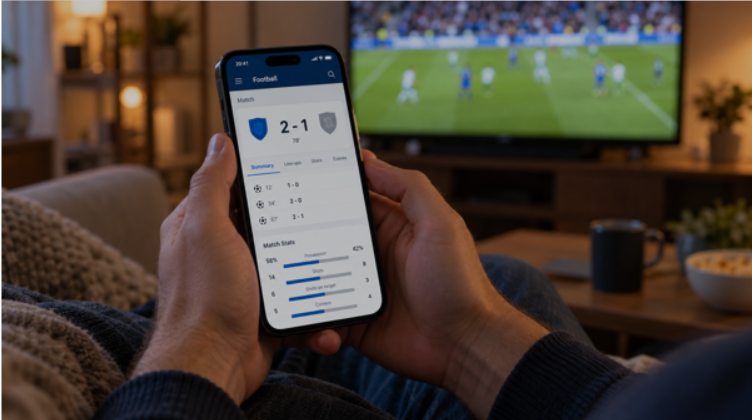
A match page should make the teams, score, and game status easy to identify. Readers should not have to scroll through several paragraphs to discover whether an event is live, finished, or scheduled for tomorrow.
Dates and time zones deserve the same attention. “Tonight at eight” may make sense to a local audience, but it becomes confusing when an article is shared elsewhere. A clearly labeled start time gives readers something they can use. Good organization also helps when someone arrives through a search result rather than the homepage. Each page needs enough context to stand on its own.
Make comparisons possible on a small screen
Sports coverage often involves comparing things: player statistics, team records, subscription packages, or ticket prices. On a desktop, a wide table can handle that reasonably well. On a phone, it may leave the most useful column hidden off-screen.
The answer is not always to squeeze everything into smaller text. Sometimes it is better to show fewer details initially, with the option to expand them.
Readers researching mobile betting sites face a similar usability question: how clearly does a service present its features, account tools, and conditions on a phone? A comparison can help identify those differences, but a convenient interface is separate from whether a service is authorized where the reader lives. Across these pages, the practical requirement is the same. People need to understand what they are comparing before being asked to choose.
Leave room for fingers and mistakes
A phone screen has limited space, but making every button smaller rarely solves the problem. Closely packed controls make accidental taps more likely, especially when someone is using one hand. Clear labels help. “View match details” tells a reader more than an unexplained symbol. A visible back button can also make navigation less frustrating when a page opens inside an app. Actions involving an account or payment deserve an extra check. Users should be able to review what they selected and correct an error before confirming it. Speed is useful; removing the chance to catch a mistake is not.
Notifications can be helpful when they announce kickoff or a final result. They become less useful when every minor update demands attention.
A sports service should let people choose which teams and events they follow, then decide what deserves an alert. Someone who wants the final score may have no interest in transfer rumors or promotional messages.
The same principle applies to the website itself. Autoplay videos and repeated pop-ups compete with the reason someone opened the page. Giving readers control over those features makes the experience easier to manage.
Try the page as a reader would
Before judging a mobile sports website, give it an ordinary task. Find tomorrow’s fixture. Open an older result. Read a report without zooming in. Locate the contact information. These small tests reveal more than a polished homepage screenshot. They show whether the site works beyond its first impression. A useful mobile website gets out of the way. The score is easy to find, the text is comfortable to read, and the next step is obvious. That leaves more attention for the sport itself.